
design agency Mucho took on the challenge of bringing a little whimsy to the rental booking experience for Overmoon. Like Airbnb, Overmoon is a vacation rental startup, though focusing its offering on family and kid-friendly rentals. This meant that branding had to reflect a stress-free booking and vacation process, but it also had to appeal to younger family members, which also means a sense of fun.
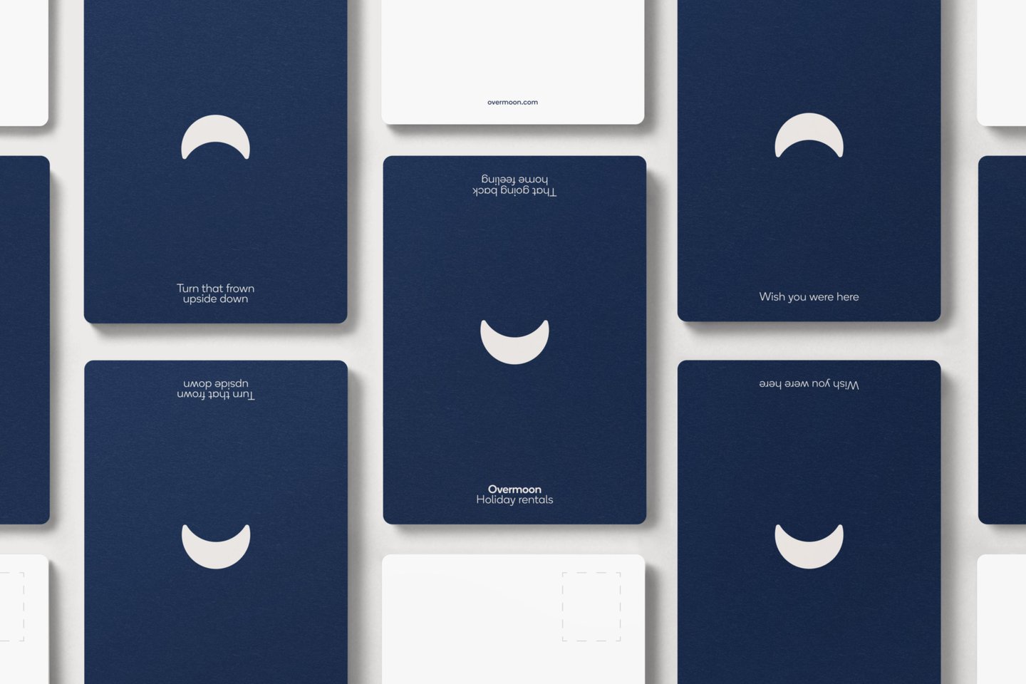
Rob Duncan, Creative Director at Mucho, says: “Having traveled with children, I fully understood the challenges and pain points that Overmoon was trying to overcome.” The message, the visuals and the name – developed with a hundred monkeys – for Overmoon, is designed to allude to a “happy” vacation, says Mucho (the name itself nods to the phrase “over the moon”). The idea of ease is perhaps best represented in the brand’s symbol, a simple upturned crescent moon in a smile. In motion, Mucho shows the moon moving seamlessly through the lunar phases to land on this final symbol.
The shape of the moon logo also appears typographically. Overmoon’s wordmark uses Boing by A2-Type, a sans serif with subtle rounded corners, “reflecting the roundness of the symbol and giving the brand a soft, friendly feel,” says Mucho.
Mucho continues this approach in a color palette inspired by the night sky, while a “do-it-yourself” style is used for photography, says Mucho. Moving away from “the stereotypical industry-standard stock photography of families on vacation,” Mucho aims to reflect the kinds of photos families might really take of each other. As a result, the brand agency hopes to spark “an emotional take on what an Overmoon experience can look like for customers,” which it describes as “key” to bringing the startup to life.
Comments are closed.