
What do you do when you want to explore patterns from location-based data? How do you know your location data isn’t random? Is it enough to rely on the correlation? Or are there other statistical methods used for this type of exploratory data analysis?
In this tutorial, I will show you how you can perform exploratory data analysis for your location data with simple and easy steps using Python. The code is also available for this tutorial in GitHub.
What is Exploratory Spatial Data Analysis (ESDA)?
Exploratory Spatial Data Analysis (ESDA) correlates a location-specific variable, considering values of the same variable in the neighborhood. The methods used for this purpose are called spatial autocorrelation.
Exploratory analysis of spatial data
In data science, we tend to explore and study data before doing any modeling or processing a task. This helps you identify patterns, summarize key features of the data, or test a hypothesis. Conventional exploratory data analysis does not explicitly study the location component of the dataset, but rather deals with the relationship between variables and how they influence each other. In other words, statistical methods dealing with correlation are often used to explore the relationship between variables.
In contrast, Exploratory Spatial Data Analysis (ESDA) correlates a location-specific variable, considering values of the same variable in the neighborhood. The methods used for this purpose are called spatial autocorrelation.
Spatial autocorrelation describes the presence (or absence) of spatial variations in a given variable. Like conventional correlation methods, spatial autocorrelation has positive and negative values. Positive spatial autocorrelation occurs when areas close to each other have similar values (high-high or low-low). On the other hand, a negative spatial autocorrelation indicates that the neighborhood areas are different (low values next to high values).
There are mainly two methods of ESDA: global and local spatial autocorrelation. Overall spatial autocorrelation focuses on the overall trend in the dataset and tells us the degree of clustering in the dataset. In contrast, local spatial autocorrelation detects variability and divergence in the dataset, which helps us identify hotspots and coldspots in the data.
Get the data
In this tutorial, we’ll be using the Airbnb dataset (point dataset) and Layer Output Super Areas – LSOA – London Neighborhoods (polygon dataset). We prepared the data using a spatial join to connect each point in the Airbnb listings to neighborhood areas.
If you want to understand and use the powerful spatial join tool in your workflow, I have a Tutorial on that too.
the clean data set we use spatially joined London Airbnb properties with an average property price in each local area (neighborhood).
For this tutorial we will be using Pandas, Geopandas and Python Spatial Analysis Library (PySAL) libraries. So first things first: let’s import these libraries.
import pandas as pd
import geopandas as gpd
import matplotlib.pyplot as plt
import pysal
from pysal import esda, weights
from esda.moran import Moran, Moran_Local
import splot
from splot.esda import moran_scatterplot, plot_moran, lisa_cluster
We can read the data in Geopandas.
avrg_price_airbnb = gpd.read_file("london-airbnb-avrgprice.shp")
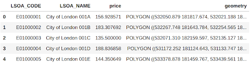
avrg_price_airbnb.head()Here are the top five rows of average Airbnb property prices in London.
Since we have a geometry column (latitude and longitude), we can map the data. here is a choropleth map average prices per district.
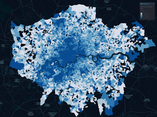
Well, with this choropleth map, we can see clustered price ranges, but it doesn’t give us any stats to determine if there is spatial autocorrelation (positive, negative, or even where the hot and cold spots are). We will do that next.
Spatial weights and spatial offset
Before performing spatial autocorrelation, we must first determine the spatial weights and the spatial lag.
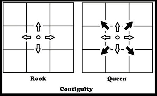
Spatial weights allow us to determine the neighborhood of the area. There are different statistical methods that we use to determine spatial weights, but one of the most commonly used spatial weighting methods is the queen adjacency matrix. Here’s a diagram explaining how it works (alongside the tower adjacency matrix for good measure).
To compute the queen adjacency spatial weights, we use PySAL.
w = weights.Queen.from_dataframe(avrg_price_airbnb, idVariable="LSOA_CODE" )
w.transform = "R"
Spatial lag, on the other hand, is the product of a matrix of spatial weights for a given variable (in our case, price). The spatial branch normalizes the rows and takes the average result of the price in each weighted neighborhood.
avrg_price_airbnb["w_price"] = weights.lag_spatial(w, avrg_price_airbnb["price"])We have now created a new column in our table that contains the weighted price for each neighborhood.
Global spatial autocorrelation
The overall spatial autocorrelation determines the overall pattern in the dataset. Here we can calculate if there is a trend and summarize the variable of interest. We typically use Moran’s I statistics to determine the overall spatial autocorrelation, so let’s calculate that.
y = avrg_price_airbnb["price"]
moran = Moran(y, w)
moran.I
We get this number for this data set: 0.54. What does this number mean? This number summarizes the statistics of the data set, just as the mean does for non-spatial data. Moran’s I values range from -1 to 1. In our case, this number indicates that there is positive spatial autocorrelation in this data set.
Remember that we only determine the overall autocorrelation with Moran’s I statistics. This calculation does not tell us where this positive spatial autocorrelation is. (Don’t worry, it’s next.)
We use Moran’s I plot to visualize the overall spatial autocorrelation, which is identical to the other scatter plots, with a linear fit that shows the relationship between the two variables.
fig, ax = moran_scatterplot(moran, aspect_equal=True)

plt.show()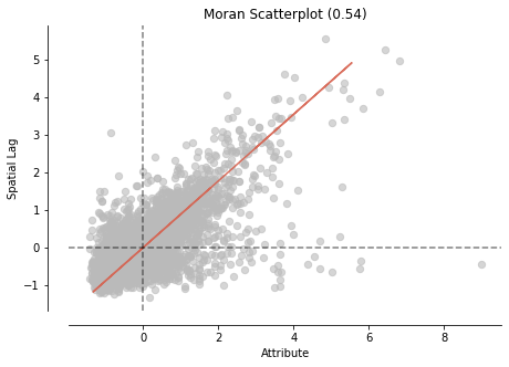
Both Me from Moran and Moran’s scatter plot I show positively correlated observations by location in the dataset. Let’s see where we have spatial variations in the dataset.
Local spatial autocorrelation
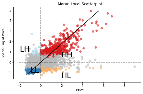
So far, we have only determined that there is a positive spatial autocorrelation between the price of properties in neighborhoods and their location. We have not yet detected where the clusters are. Local Indicators of Spatial Association (LISA) are used to do this. LISA classifies areas into four groups: high values close to high values (HH), low values with nearby low values (LL), low values with high values in its vicinity and vice versa.
We have already calculated the weights (w) and determined the price as our variable of interest (y). To compute local Moran, we use the functionality of PySAL.
# calculate Moran Local
m_local = Moran_Local(y, w)
Now we plot Moran’s local point cloud.
# Plot
fig, ax = moran_scatterplot(m_local, p=0.05)
ax.set_xlabel('Price')
ax.set_ylabel('Spatial Lag of Price')
plt.text(1.95, 0.5, "HH", fontsize=25)
plt.text(1.95, -1.5, "HL", fontsize=25)
plt.text(-2, 1, "LH", fontsize=25)
plt.text(-1, -1, "LL", fontsize=25)
plt.show()
The scatter plot divides the areas into four groups, as mentioned.
Now this it’s cool. We can see all the values sorted into four groups, but the exciting part is seeing where these values cluster on a map. Again, there is a function in PySAL (splot) to plot a map of LISA results.
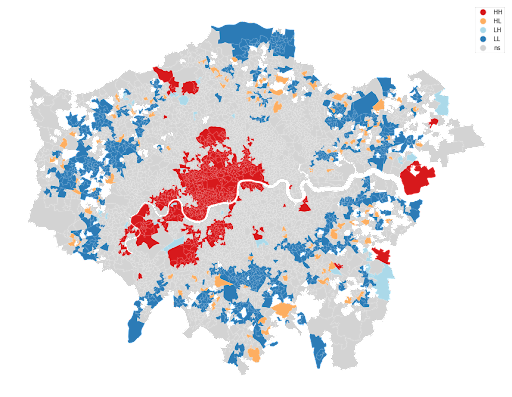
The map above shows the variation in the average price of Airbnb properties. Red colors indicate clustered neighborhoods, which have high prices surrounded by high prices as well (mainly the center of the city). Blue areas indicate where prices are low, also surrounded by areas with low value prices (mainly peripheries). Equally interesting is the low-high and high-low zone concentration.
Compared to the choropleth map we started with in this tutorial, the LISA is less cluttered and provides a clear picture of the dataset. ESDA techniques are powerful tools that help you identify spatial autocorrelation and local clusters that you can apply to any given variable.
Comments are closed.